This is the first post in my Real Trade Series, where I go through actual trades from my own charts, wins, losses, and everything in between, and break down exactly what I was thinking at the time. No cherry picking only the winners. The goal is to show you real decision making, including the trades that could easily have gone wrong.
Not every trade needs to end in a big win to be worth writing about. Some of the most useful trades in my journal are the small ones, the ones where I saw a risk clearly, sized down because of it, and let the market prove me right or wrong within a day or two. This is one of those trades. Avanti Feeds, early January 2022.
I want to walk through this one in detail because it’s a good example of something every swing trader deals with eventually: what do you do when two timeframes are telling you different things at the same time.
Where the stock was coming from
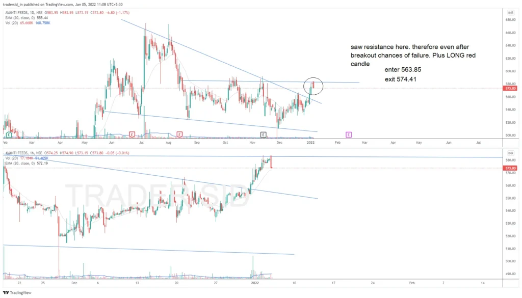
Avanti Feeds had a rough second half of 2021. If you pull up the daily chart from June onward, you can see the stock topped out and then spent the next six months in a clean descending channel. Lower highs, lower lows, the kind of grinding downtrend where every rally gets sold into. That’s not a controversial read of the chart. Anyone looking at it would say the same thing: sellers are still in control here, and price needs to prove otherwise before you trust a bounce.
By the first week of January, price had worked its way back up to the top of that channel, right into the descending trendline near 580. This is the exact zone where the stock had failed multiple times before. Nothing about that resistance level was new or hidden. I could see it, and I wrote it down before I even placed the trade.
What the hourly chart was showing me
Here’s where it gets interesting. If you zoomed into the one hour chart, the picture looked completely different. Price was in a tight rising channel, making higher lows, grinding up toward the same resistance zone with what looked like decent strength. On a shorter timeframe, in isolation, this looked like a perfectly reasonable breakout attempt.
This is the trap. If I had only been looking at the hourly chart that day, I would have taken this trade with full confidence. The structure was clean. The momentum looked real. Nothing about the one hour price action was screaming caution.
But I wasn’t only looking at the hourly chart, and that’s the part of this trade I actually want to focus on.
The note I left myself
Before I entered, I wrote a note directly on the chart. It said the resistance overhead meant there was a real chance of breakout failure, and on top of that, the candle that triggered my entry was a long red candle on the daily timeframe. Not a strong green breakout candle. A red one.
If you’ve been trading for any length of time, you already know that a long red candle right at your entry point is not a great sign. It usually means there was real selling pressure that day, even if price technically pushed through a level on an intraday basis. I saw this. I wrote it down. And I took the trade anyway, just at a smaller size than I normally would have.
I entered at 563.85.
How it played out
I exited at 574.41. That’s close to a two percent gain, which sounds fine on paper, but the number itself isn’t really the point of this story. The point is why I exited when I did.
I didn’t wait around to see if the resistance would matter or not. I had already told myself, before the trade, that this level was likely to cause trouble. So when price started stalling right where I expected it to stall, I got out. No hoping, no waiting for one more candle to confirm what I was already fairly sure was going to happen. I took the small gain and moved on.
Looking back, if I had ignored my own note and held for a bigger target because the hourly chart still looked strong, there’s a good chance this trade turns into a loss instead of a small win. The daily resistance was real. The stock needed more time to actually clear that zone, and it wasn’t going to happen in one clean move off a long red candle.
Why this matters more than the numbers
This wasn’t really a setup failure. The hourly pattern was fine. What this trade actually tested was whether I would listen to the higher timeframe when it disagreed with the lower timeframe, and thankfully, that day, I did.
This is exactly why the five step framework I use starts with market direction and sector strength before it ever gets down to entry timing on the daily or hourly chart. An entry setup can look completely clean in isolation and still be walking straight into a wall that only shows up when you zoom out. That’s not a flaw in the entry timeframe. That’s just how breakouts into resistance tend to look right before they fail. They look fine until they don’t.
The daily and weekly charts are what tell you the wall is there in the first place. The hourly chart is just where you time your click. If you only ever look at the timeframe you’re trading on, you’re going to miss context that’s sitting right there on a higher timeframe, plain as day.
What I’d do differently today
If I saw this exact setup now, a few things would change. I’d probably skip the trade entirely rather than take it small, simply because the risk to reward on a breakout into known resistance rarely justifies the entry, even at reduced size. Back then I was still willing to test resistance zones with a small position just to see what would happen. Today, I’d rather wait for the stock to either clear that zone with real conviction, a strong green candle and volume well above average, or wait for a proper base to form above the resistance before getting involved at all.
I’d also be paying closer attention to where the 10 week and 40 week moving averages sat relative to each other on the weekly chart, since that tells you a lot about whether the broader trend actually supports a breakout attempt or whether you’re fighting the tape.
What I take from this trade
The checklist item this trade reinforced for me is simple to state and harder to actually follow in the moment: if price is pushing into a well defined resistance zone on the higher timeframe, it doesn’t matter how clean the lower timeframe entry looks. Size down or skip it. Expect an early exit if you do take it. Don’t be surprised when the higher timeframe wins the argument, because it usually does.
I got lucky in the sense that this one worked out to a small gain instead of a loss. But I don’t think it was luck that I got out when I did. That part came from writing the risk down before I ever placed the trade, so that when the moment came to make a decision, I wasn’t reacting emotionally to price. I was just following what I already knew going in.
That’s really the whole point of keeping notes on your own charts. Not to be right every time, but to give yourself something honest to look back at, especially on the trades that don’t go the way the lower timeframe promised they would.
If you’ve got a trade sitting in your own screenshot folder that taught you something the hard way, that’s usually the one worth writing about. The clean wins make for good highlight reels. The messy ones make you a better trader.